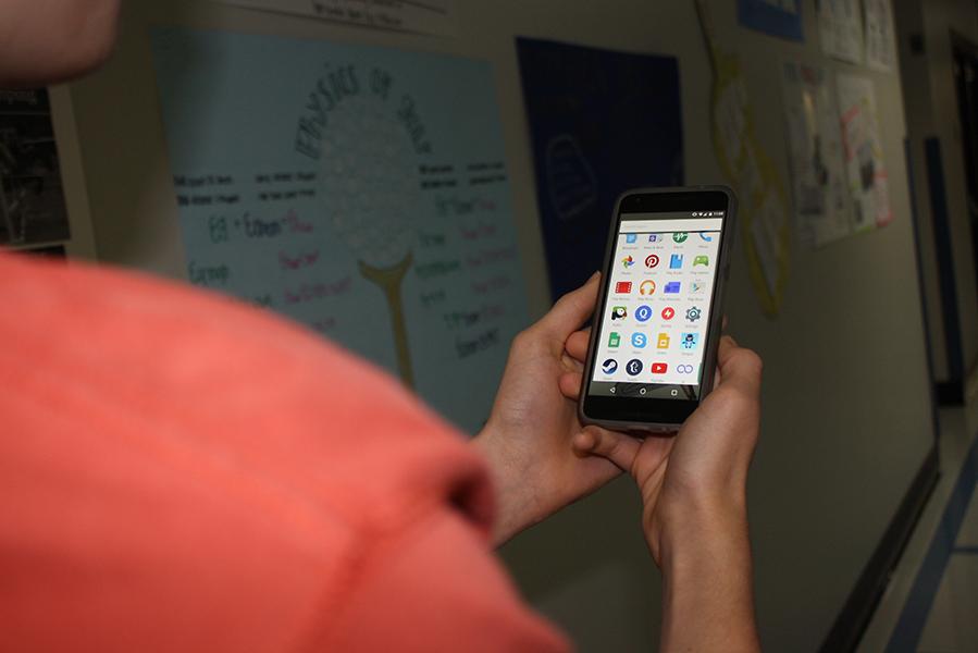
From Ice Cream Sandwich, to Jelly Bean, to KitKat now on to Marshmallow. Google’s tradition of naming operating systems after sweet treats has produced Android Marshmallow 6.0, and two new flagship phones with it. The Nexus 5X and Nexus 6P went on pre-order on Sept. 29, and both phones were officially unveiled on Oct. 29.
The look and feel of the phone, straight out of the box, is clean and simple. The soft blue back is a nice change from the sparkly white glass of the Nexus 4, and the dual front-facing speakers are not obtrusive. The power and volume buttons are conveniently placed, about midway down the side, and are easy to reach. The 5.2 inch screen does not make the device feel cumbersome or overly large, a rare trait among today’s smartphones.
Perhaps one of the biggest hardware changes in the Nexus 5X, when compared to previous devices, is the fingerprint sensor on the back. Google’s innovative placement of the sensor allows the user to shift their finger an inch or two and be on the sensor, something proving to be very convenient. Google implemented the sensor to work with Android Pay and to lock the phone, and set up is extremely easy.
The entire Nexus line runs pure vanilla Android, meaning that manufacturers have not deviated from what Google intended Android to run like or look like. This, in itself, is a reason to get a Nexus, along with the fact that Google gives its Nexus devices an almost immediate upgrade to new operating systems, often months ahead of Samsung’s flagships. Many manufacturers add their own widgets or even entire apps to their phones, but with Nexus devices you get nothing except Google’s apps, like Drive, Translate and Maps.
Android Marshmallow is just as light as a real marshmallow. Google simplified all of its app icons, decluttered the lock screen and cleaned up the app tray. All app icons take up only as much space as they need, leaving more space to see the wallpaper, as well as an illusion of more space between the apps, making the operating system’s entire look seem much cleaner. A clock is all you see on the lock screen in Marshmallow, and any notifications that you allow to show up on your lock screen are opaque. Instead of having multiple pages, one next to the other for an app tray, Google eliminated pages altogether. Now, the app tray is one long screen with all of your apps, as well as a whole row at the top, set apart from the rest of the app tray by a thin gray line, to hold your four most-used apps, a small feature that makes the whole OS feel much more thought-out.
Within Google’s apps, developers opted for a simple, bright look. The Messenger app looks much more modern and much less bulky than in Kit Kat, and got the largest facelift. All of the other apps were optimized for speed without compromising functionality, and as a result all of the phone’s software appears much more professional and much more modern.
Overall, the Nexus 5X impressed me. The device is powerful, fast and clean, and Android Marshmallow is no different. Google raised the bar for all other manufacturers and developers with the 5X’s attractive look and adaptable features.
The Pathfinder gives the Google Nexus 5X a 10/10.


![There are more than 20 open cardio machines at Crunch Fitness. I enjoyed the spacious environment at Crunch, a sentiment that was shared by sophomore Sanjana Daggubati. “[Going to] Crunch Fitness was the right decision because [it] feels more professional. Crunch’s workers are laid back, but not to the point where they don't care,” Daggubati said.](https://pwestpathfinder.com/wp-content/uploads/2025/09/IMG_5242-1-1200x900.jpg)

![Various empty Kit Kat wrappers crowd the desk, surrounded by scoring sheets. While production of Kit Kat flavors in the U.S. is limited, Nestlé, the owner of Kit Kat, manufactures hundreds of unique flavors in Japan, including the flavors ocean salt and passion fruit. “I thought there [were] some interesting flavors, and a lot of them were really unexpected,” senior Elle Levesque said.](https://pwestpathfinder.com/wp-content/uploads/2025/09/image-2.png)


![Pantone’s selection of the 2025 Color of the Year is revealed: Mocha Mousse. Ceramics teacher Ashley Drissell enjoys this year’s selection. “Maybe it’s the name but [Mocha Mousse] reminds me of chocolate and coffee. It makes me hungry. It’s very rich and decadent,” Drissell said.](https://pwestpathfinder.com/wp-content/uploads/2025/02/DSC_0015-1200x800.jpg)


